Our world faces a growing number of complex issues. As citizens, we have a responsibility to make informed decisions on issues like sustainability, health and wellbeing and more. The scientific community has been investigating and collecting data on issues that affect us all. They’re skilled at effectively communicating this information to other scientists – people who already speak the specialised language of science and have had years of practice interpreting datasets and graphs. To help the public make critical decisions, scientists need to be able to communicate the information in a different manner.
One way to do this is with infographics. An infographic is a visual presentation of information using graphic images and text. Infographics are useful for breaking down and simplifying things that might be difficult to comprehend – such as data and statistics.
An effective format
Stats NZ Tatauranga Aotearoa – New Zealand's official data agency – acknowledges that infographics are a powerful way of getting messages out in an effective format. Although graphs are conventional ways of presenting data, a graph often uses a single dataset to present a snapshot in time. Infographics are different. They are able to show a variety of things in a single figure – including connections and relationships within the information.
One of the key features of an infographic – its simplicity – is also one of its biggest risks. Infographics are designed to be visual so there’s often not a lot of text included. To get the full meaning from an infographic, it’s important to look at the context. Infographics are usually placed within an article, which helps the reader interpret the infographic.
Nature of science
Developing visual and numerical literacies, such as those used in infographics, supports the New Zealand Curriculum’s ‘Communicating in science’ achievement aim.
Communicating climate change
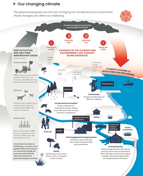
Stats NZ and the Ministry for the Environment collaborated to prepare Our atmosphere and climate 2020. The team used numerous datasets to show the drivers of climate change and how they are affecting temperatures, the ocean and what is happening on the land. The report is written for the general public, so it’s crucial that the information is presented in an understandable format.
The report runs to around 70 pages, but the essence of the report is reflected in the following infographic. It communicates the themes and tells a brief story about Aotearoa New Zealand’s climate connections. However, to understand the infographic in a meaningful context, you need to dip into the report.
Constructing an infographic
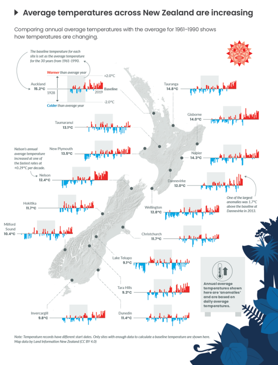
Infographics consist of three components – the visual component, the content component and the knowledge component. Examples of the components are displayed in the infographic below. This infographic is about temperature anomalies – whether annual temperatures are warmer or colder than baseline temperatures gathered over a 30-year period.
The team had to think carefully about each of the three components. The visual component includes graphics and colour. Particular colours represent data in certain ways, so it makes sense to report temperature anomalies using the colours red and blue – the colours we associate with hot and cold. The content component features statistics – data for each site that reports the average annual temperatures and anomalies. The knowledge component is the insights that come from data – average annual temperatures are warming in many locations.
Communicating scientific information via this infographic makes temperature statistics much easier to visualise and understand. Ideally, it will engage citizens to make informed decisions about climate matters.
Related content
‘Communicating in science’ is a key strand of the nature of science. Read why it is so important in this article.
The ClimateViz citizen science project needs help interpreting climate change graphics to help combat misinformation and support scientific communication.
The Department of Conservation and the Science Learning Hub have collaborated to create a series of interactives that feature many of DOC’s marine infographics.
- Marine diversity in Aotearoa New Zealand
- New Zealand marine habitats
- Threats to marine habitats
- Areas of marine ecological importance
- Mussel reefs and biodiversity
We've curated a selection of bilingual and reo Māori infographics and diagrams in this handy collection. Visual representations provide excellent opportunities to develop literacy practices and learn new information.
Activity ideas
Students explore the components of an infographic and then create their own in the activity Using infographics.
Te Kāhui o Matariki – interpreting infographics provides additional opportunities to explore the literacy components of infographics.
Viruses and immunity – interpreting infographics uses colourful infographics to learn about viruses, the immune system and staying safe.
Creating kōwhai infographics explains how to use infographics as a means of summarising students’ research findings.
Useful link
The Science Learning Hub has curated a number of infographics in our Science infographics Pinterest board.
Acknowledgement
This resource has been produced with the support of the Ministry for the Environment and Stats NZ. (c) Crown Copyright.


